- Bluell
- Blog
- Android
6 tips to instantly make your interface design more user-friendly
- Development
- 9 min Read
- 19 May 2025
Users don’t care how smart your interface looks if they can’t figure out how to use it in five seconds.
The user interface is the first impression. It guides users and silently communicates between your product and its users. Yet many interfaces fail not because they lack functionality, but because their design ignores the user experience.
If your app or website isn’t simple, clear, and fast, people will leave. There won’t be any second chances. Every pixel on the screen has a job. If it confuses or distracts the user, it hurts the experience.
Design tip: “If users need to read a manual, your interface has already failed.”
So, how do you create an interface design that people love to use? Not just once, but over and over again?
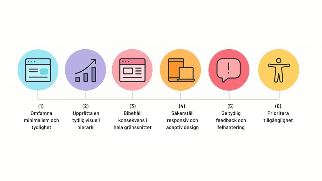
Here, we share six brutally effective tips to instantly make your interface design more user-friendly. These aren’t vague design theories. They’re practical, battle-tested, and based on what actually works in real-world digital products.

1. Embrace minimalism and clarity
Most interfaces are far too busy. Designers try to impress with gradients, shadows, animations, and five different buttons on the same screen.
The result? Users are overwhelmed. When everything is important, nothing is.
Simple design isn’t about being simple or boring. It’s about getting rid of anything that doesn’t help the user. When your interface is too cluttered, people can get confused or lost. But when things are clean and focused, it’s much easier for users to find what they need and move around smoothly. Explore how we achieve clarity in UI/UX design to see how minimalism can improve usability and increase conversions.
Benefits of keeping interfaces simple
- Faster loading times = better UX and SEO.
- Reduces user frustration and cognitive load.
- A cleaner design leads to a stronger brand perception.
Tips for avoiding clutter and distraction
- Prioritize content: Determine what information is important and remove what isn’t.
- Use white space: Let the elements breathe, don’t cram everything into one space.
- Limit the color palette: Stick to 2-3 dominant tones to avoid visual chaos.
- Consistent typography: Use one or two fonts to maintain readability and cohesion.
2. Establish a clear visual hierarchy
You can avoid this mistake by prioritizing developing only the most important features that meet your users’ initial needs. Adopt an agile development process that allows you to develop features in chunks based on user feedback and their requirements.
Mistake #3: Neglecting the importance of UX/ UI
Visual hierarchy is how users know where to look first. Without it, everything feels flat. You have 3-5 seconds to show the user where to focus. Things like font size, colors, and spacing aren’t just for looks, they’re how your app tells the brain what to focus on and what to do.
If users can’t tell you what to do next, your interface has failed. Period.
Strong versus weak hierarchies
| Element | Strong hierarchy | Weak hierarchy |
| Heading | Big, bold and high contrast | Same size as the body text |
| Call to action | Light color, isolated area | Blends into the layout |
| Navigation | Prioritized, easy to scan | Tight, identical weight to body text |
| Distance | Consistent padding and alignment | Uneven, messy layout |
A strong visual hierarchy guides users through the interface. It highlights the most important elements first. For example, a bold heading with smaller subheadings and body text creates a clear path for the eye to understand the structure.
A weak hierarchy, on the other hand, lacks distinction and confuses users about where to focus.
Tips for creating better hierarchies :
- Size and weight : You can use larger, bolder text for headings.
- Color and contrast : Highlight elements with contrasting colors.
- Spacing and Alignment : You can group the related objects and align them consistently.
- Images and icons: Use images to draw attention to important areas
3. Maintain consistency throughout the interface
Do you want users to feel confident using your product? Provide them with consistency. If each screen has different button styles, label formats, and navigation logic, users will have to relearn your app every time.
According to NN/g, you can increase usability by almost 47% by making layouts more scannable. Being consistent doesn’t mean being boring. It means building trust by doing so through predictability. And in the user interface, predictability = usability.
Tools and methods to ensure consistency
- Design System: Build and maintain a living design system (Figma, Storybook, etc.).
- Component library: Use reusable components across screens.
- UX Audits: Regularly review your interface for inconsistencies.
- Front-End Style Guides: Ensure developers follow the same rules.
4. Ensure responsive and adaptive design
You can’t assume that users are always on a desktop. The Statista 2024 report shows that over 55% of global web traffic comes from mobile. If your interface doesn’t fit or work well on smaller screens, people will leave.
Responsive design adapts your website in a way that fits screens of all sizes. Adaptive design goes further and changes the experience based on the device’s capabilities and capabilities. In 2025, you’ll need both to satisfy users.
Responsive vs adaptive interface design
- Responsive: It is a flexible grid system. A design that stretches or shrinks based on screen size.
- Adaptive: Multiple fixed layouts based on breakpoints (e.g. mobile, tablet, desktop).
Design tip : “If users need to read a manual, your interface has already failed.”
Tips for testing on different devices and screens
- Emulators and simulators : You can test on virtual devices using platforms like BrowserStack or LambdaTest.
- Real-world device testing: Check performance on actual hardware.
- User testing: Collect feedback from users on different devices.
5. Provide clear feedback and error handling
Users often blame themselves when things go wrong, even if it’s not their fault. That’s why good feedback and error handling are important. When users take an action, they need to see a response, something that shows that the system has noticed and is doing something. Without this, people can get confused or think that nothing is happening. The purpose of feedback is to let users know that their actions have been received and processed.
Types of feedback
- Visual : Highlight a button when you click it. (Color changes, loaders, check marks, error icons)
- Auditory: Sounds that indicate success or failure
- Haptics : Vibrations that confirm an action on mobile devices.
Effective error handling means clear messages that guide users to fix problems without frustration.
6. Prioritize accessibility
An interface is not truly user-friendly if it only works well for some people. More than a billion people live with some form of disability. Leaving them out is not only unfair, it also means missing out on a large number of potential users.
When you design with accessibility in mind, you make things easier for everyone, not just people with disabilities. It helps people with vision impairments, dexterity issues, or reading difficulties. It also helps users in common situations like low light or loud places.
Common accessibility
- Low-contrast text: Use a contrast ratio of at least 4.5:1.
- Missing alt text: Always describe visual content.
- Keyboard navigation gaps: Make sure users can tab through all actions.
- Non-descriptive links: Avoid “click here.” Use context-specific text.
Accessibility compliance testing tools
- WAVE: Evaluates web accessibility.
- Axe: Analyzes pages for accessibility issues.
- Lighthouse: Reviews performance and availability.
Pro tip: Follow WCAG 2.2 guidelines to remain compliant and user-centric.
Conclusion
Do you want people to stick with your product? Value their time. Keep things simple, fast, and error-proof. That’s the essence of user-friendly interface design. Implement these six principles today, and you’ll immediately start seeing better engagement, lower bounce rates, and happier users.
Need help redesigning your interface? Contact our team at Bluell. We build human-centric digital products that work effectively on any screen.
Table of contents
Contact us
Book a call or fill out the form below and we will get back to you once we have processed your request.


